

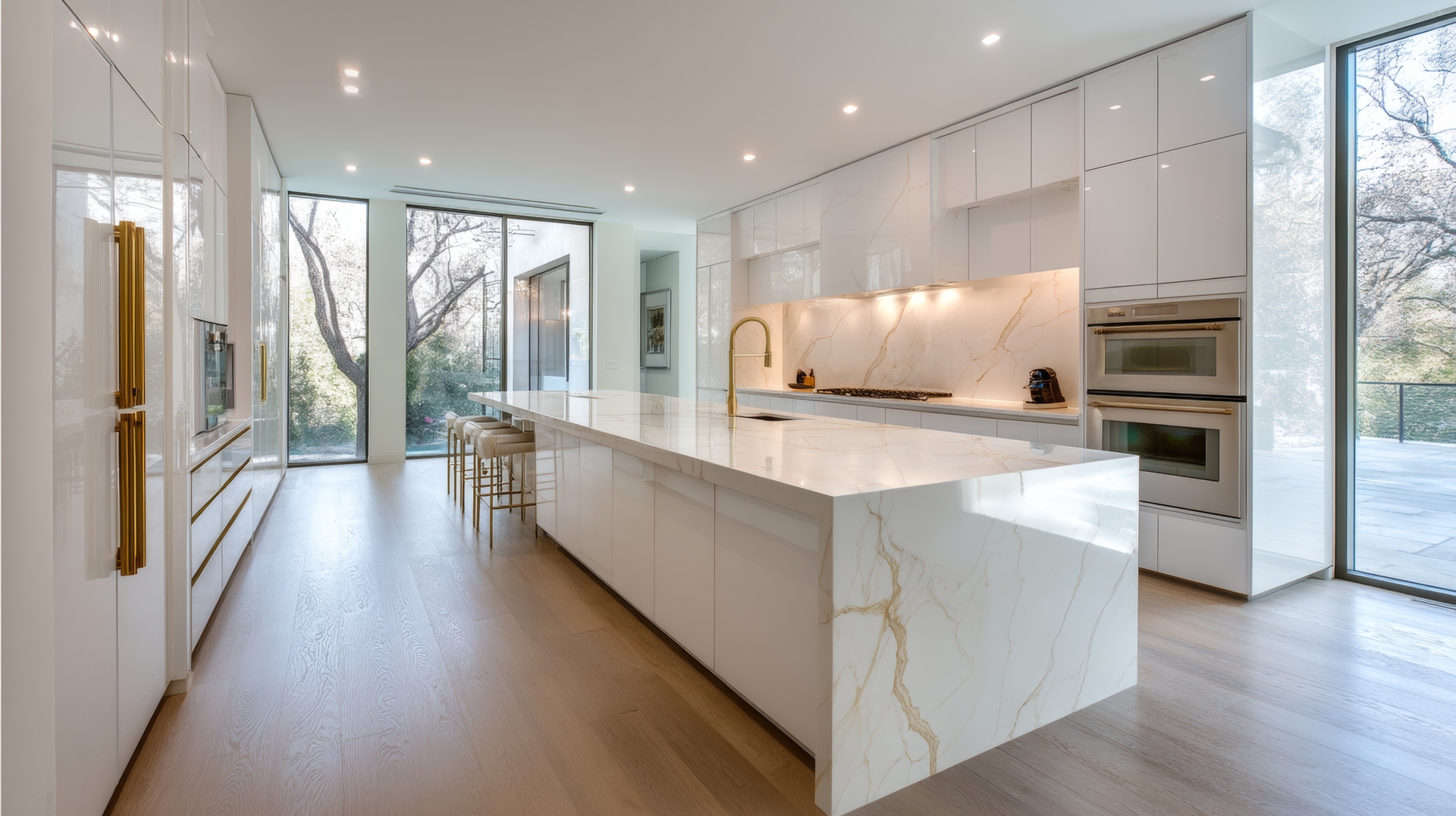
Luxury vinyl plank (LVP) flooring continues to rise as a go-to choice for homeowners who want stunning visuals, long-lasting performance, and versatility at every turn. One of the most defining design decisions when selecting LVP isn’t the plank width or the texture—it’s the color tone. The warmth or coolness of the shade can completely shift the mood in a room, tie together transitional design styles, and help highlight other materials throughout the space.
Whether refreshing a cozy family room or planning a sleek, modern kitchen, understanding warm vs. cool tones in LVP makes the process smoother and more rewarding. Here’s a deep dive into what each palette brings to the home and how to choose the perfect tone for each room.
Exploring how warm tones shape a space
Warm-toned LVP includes honey, caramel, chestnut, golden oak, warm beige, and brown-based grays. These hues naturally invite comfort into a room.
Warm tones create:
A welcoming, lived-in atmosphere
Natural harmony with rustic and classic design styles
An easy match with warm décor accents like brass, terracotta, and cream
Warm LVP shades work especially well in spaces that benefit from added coziness—think living rooms, bedrooms, dens, and family gathering spots. Golden and amber tones help make larger rooms feel more grounded and intimate, especially when paired with soft textiles.
Looking at cool tones and their modern appeal
Cool-toned LVP includes driftwood gray, slate, ash, greige, and taupe with blue or green undertones. These shades pull clarity, freshness, and modern simplicity into a space.
Cool tones offer:
A crisp, airy aesthetic
Compatibility with modern, minimalist, and Scandinavian interiors
Natural balance with whites, blacks, silvers, and coastal palettes
Cool colors excel in kitchens, bathrooms, and entryways—spaces where light, sleek lines, and clean contrast are part of the design vision. The subtle undertones also help highlight cabinetry, stainless steel appliances, and contemporary hardware.
Understanding undertones to avoid mismatches
Two planks may look “gray,” yet one can lean warm with a brown base, while another leans cool with blue undertones. Undertones determine whether the floor complements or clashes with surrounding décor.
Helpful tips to identify undertones:
Compare flooring samples next to white paper to make the undertone more visible
Pair the sample with wall paint chips to test harmony
View the sample in morning and evening light to check consistency
Matching undertones between floors, cabinetry, and furniture brings a natural flow to the home. A mismatch—such as cool floors paired with warm orange-toned cabinets—can make the room feel disjointed unless balanced with neutral décor elements.
How natural light affects warm and cool tones
Sunlight changes everything in flooring design. Warm sunlight amplifies warm tones, making them appear richer, while cool hues can appear slightly warmer depending on the direction of the light.
Think about:
North-facing rooms: Light tends to be cooler—cool tones become crisp, while warm tones balance the chill.
South-facing rooms: Bright, warm light boosts the richness of warm tones and softens cool grays.
Interior rooms without windows: The lighting style (warm LED vs. daylight LED) becomes the deciding factor.
LVP samples should always be viewed in the actual room to understand how the light interacts with the shade.
Blending warm and cool tones throughout the home
Today’s homes often blend multiple design styles, making it common to mix warm and cool tones. The key is to keep one element consistent—whether that’s the flooring, cabinet color family, or wall tone.
Ways to blend effectively include:
Pairing warm floors with cool-toned furniture to create contrast
Choosing greige LVP as a middle ground for open floor plans
Mixing metals—such as warm brass with cool chrome—for a balanced look
Greige remains a top choice because it effortlessly walks the line between warm and cool, giving design flexibility without shifting drastically in different lighting.
Choosing the right tone based on room function
For cozy spaces: Warm LVP shades make family rooms, living rooms, and bedrooms feel inviting and comfortable.
For modern spaces: Cool LVP tones help kitchens, home offices, and bathrooms feel clean, bright, and uncluttered.
For open-concept homes: Mid-tone shades such as greige or soft brown-gray allow seamless transitions from one area to the next.
For high-light areas: Cool tones maintain a crisp look, preventing too much warmth from overpowering the room.
For low-light spaces: Warm tones add depth and softness where natural light is limited.
Want a flooring palette that feels intentional and beautifully balanced? Explore curated LVP options with our team
Choosing warm vs. cool tones isn’t just about color—it’s about the feeling the room should evoke. Whether designing a crisp modern space or creating a comfortable retreat, LVP offers a palette that supports every vision. Consider your lighting, décor, and long-term design plans when selecting a tone, and trust the flooring to elevate the entire home.
For homeowners searching for guidance, Carpet Trends in Rye, NY and New Canaan, CT is here to help. With decades of experience, a welcoming showroom, and a team of flooring experts who understand tone, texture, and style, Carpet Trends makes choosing the perfect LVP color palette feel effortless. Visit today to explore options crafted to fit every home.


